Plot per-cluster heatmaps for scaled and z-score expression
Source:R/hc_plot_expression.R
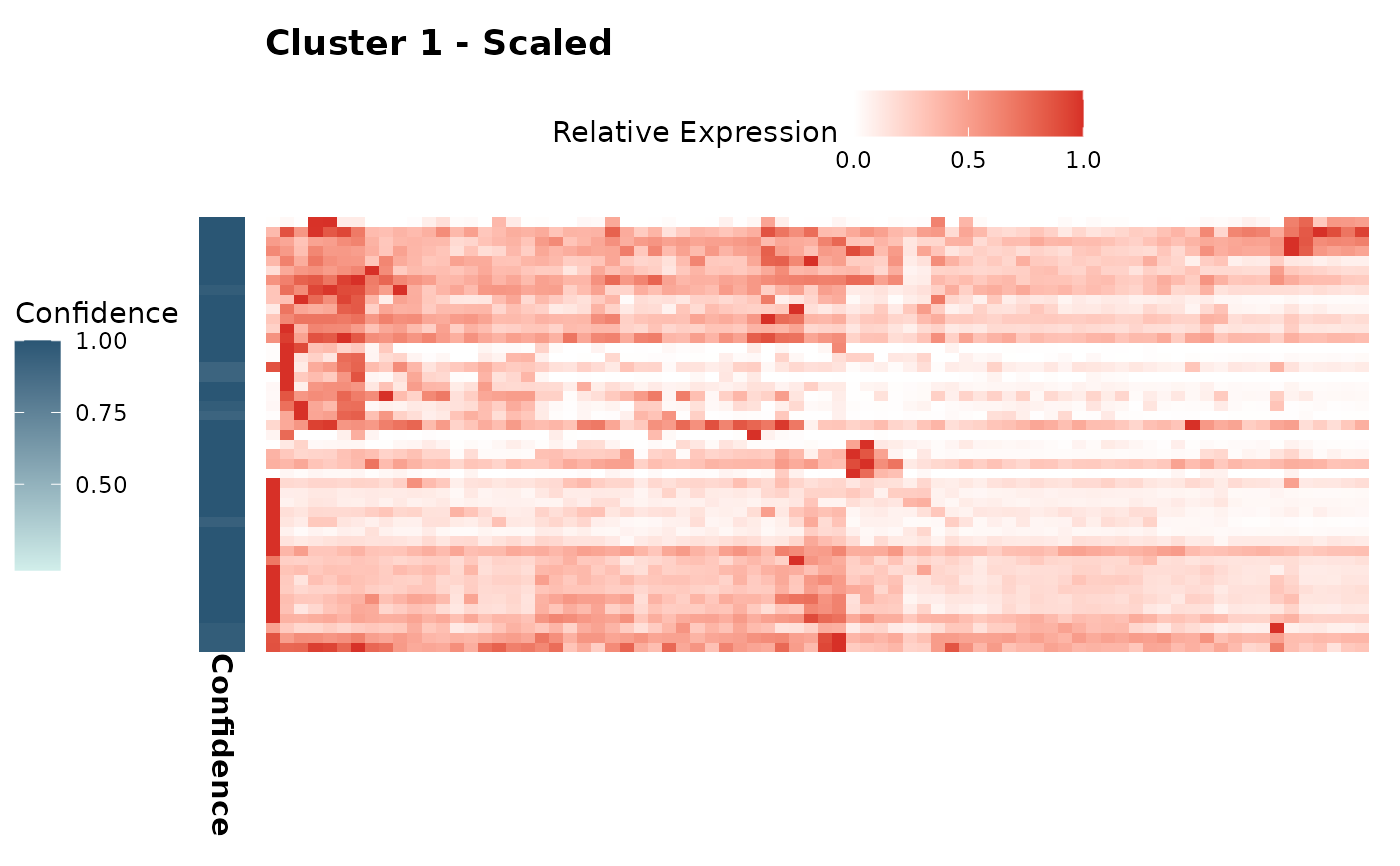
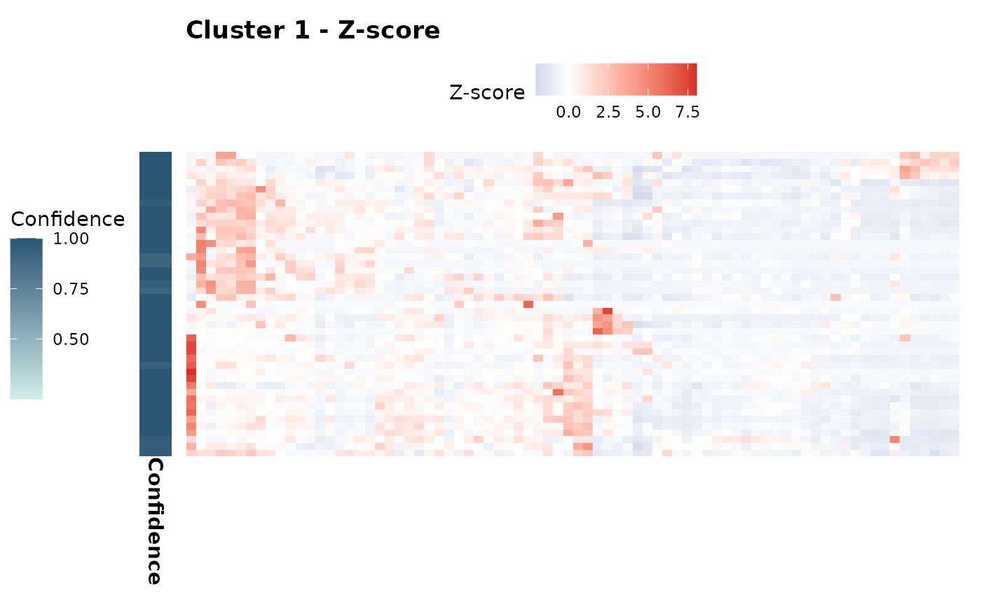
hc_plot_expression.Rdhc_plot_expression() creates heatmaps of gene expression for each cluster identified in the AnnDatR object. It generates two types of plots per cluster: one showing z-score normalized expression and another showing scaled relative expression. Each heatmap is accompanied by a confidence bar indicating the membership confidence of genes in the respective cluster.
Usage
hc_plot_expression(AnnDatR, scaled_limits = c(0, 1), show_sample_labels = TRUE)Examples
# Run clustering pipeline
adata_res <- hc_pca(example_adata, components = 40)
adata_res <- hc_distance(adata_res, components = 20)
adata_res <- hc_snn(adata_res, neighbors = 15)
#> Building SNN based on a provided distance matrix
#> Computing SNN
adata_res <- hc_cluster_consensus(adata_res, resolution = 7)
#> Iteration: 0 *** value: 948.279
#> Iteration: 1 *** value: 70.5063
#> Iteration: 2 *** value: 22.246
#> Iteration: 3 *** value: 22.2447
#> Iteration: 4 *** value: 22.2447
#> Minimum: 22.2447
#> Joining with `by = join_by(cons_cluster)`

# Plot expression heatmaps
expression_plots <- hc_plot_expression(adata_res, show_sample_labels = FALSE)
expression_plots$zscore[["1"]]  # Z-score plot for cluster 1

expression_plots$scaled[["1"]]  # Scaled plot for cluster 1